Summary: This is how I led the creation of a design system which reduced 80% our internal tasks and optimized the page creation time from days to only hours.
Giving you context
I worked as UX Lead in the Digital Experience department at a semiconductors company. So every month, we could update or create dozens of new webpages.
But we couldn't build fast and consistent pages. Marketing, engineering and support departments wanted to build pages as they needed without constraints.
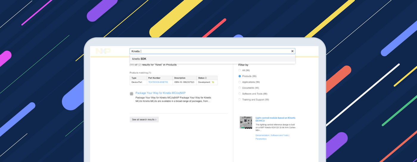
Moreover, our customers were struggling with finding information, even in our search tool. We had an 8000-pages website to cover product applications, e-commerce and corporate purposes.
So more than another process, we needed a tool. We had to produce consistent content and UI by matching customer's information needs.
About my process
Building a product is not a linear process. Collaboration among teams and disciplines to produce iterations is fundamental. Because business requirements, research insights, prototyping and feedback change sometimes at the same time.
So, making this easier to read, I wrote about the activities flow into 6 well-known categories:
This case study focuses in core problem: producing modular templates for building a consistent user experience.
Strategy
This is often forgotten or misunderstood. At the beginning of every project, I ensure the team has to be clear on:
Key users of the solution
Marketing specialists. From France, Netherlands and USA. They know the business and could have a medium understanding of the product and customer. But they don't know much about the website.
Hardware engineers. From Austin, TX.From Austin, TX. They have a deep product knowledge and medium understanding of the customer needs. In the other hand, they don't have much context on the website nor business.
Content publishers. From Guadalajara, Mexico. They are the bond between the other departments and us. They have a medium understanding of the products and the website. But they don't have much context on the business or customer.
Main scenarios
At skype's calls with shared screens. They would use the solution as:
- Reference during content redesign discussions
- Guide to build new pages or website areas
Business goals
- Build a website with all our PowerPoint guides, Excel templates and Word guidelines
- Reduce 50 % publishing time by reconnecting marketing, product and content teams
Project’s team
A UI Designer. At Guadalajara. She provided the content and visual assets for the UI documentation.
A Sr. UI Developer. From Austin. He developed the UI modules and introduced the use of React Gatsby for the guidelines website.
Me, as UX Design Lead. At Guadalajara but some meetings from Austin. I led the project and design system. So I designed the IA and UI of the website. Besides, introducing user research and usability testing into the process.
Our Digital Experience Manager. At Austin, but traveling often to Guadalajara. He managed UX/UI, web development and content publishing teams. So he was the final approver of the project.
Methodology
We added this internal project to our UX kanban board and reported progress in our daily stand-up calls with our manager. Besides, I had weekly revision calls with marketing and website managers to review insights and discuss features.
Research
Interviews and contextual inquiry
I went withI went with the content publishing team and interviewed around eight people. I asked process-oriented questions so I could map and understand the full picture. In few words, I basically looked for:
- Outputs. What are your deliveries?
- Inputs. What do you need to start?
- Resources. What is essential for your work?
- Control. Who are the decision-makers?
- Tasks. How do you produce your deliveries?
And, I ran part of the process doing their work. This way I was able to empathize and identify some of the pain points.
Publishers struggle to explain website constraints and design standards. This creates internal tasks such as UX consulting and IT meetings. So page creation gets longer.

To share this to my team, I reduced the process to touchpoints. As you can see, publishers are overloaded in the left side. Those are a lot of resources delivered by different people and channels.

We would need to reduce those touchpoints to only one. Making all transparent to everyone so even Marketers (at the right) could actively find answers by themselves without help.
In other words, we had to create one-stop-shop with:
- Page templates with mandatory and optional components.
- Code for recreating each component with their approved variations.
- Content guidelines to use properly and intentionally each specific component.
I communicated to my team, we also needed to evolve our UX practice. We had to rework our process to provide designs in a systematic way!
Journey Map: Matching business and customers
I analyzed our corporate website navigation so I could identify the information needs as page templates. I realized we needed to match the product hierarchy with the user's expected action.
This is the content journey -and templates- we had to build: Visit > Explore > Engage > Compare > Buy. So going from general to the details, our customers could find information as they needed.

Modular pages
Inspired by the Atomic Design Methodology, I classified the page template’s parts. So every Page would use a Template according to a story to tell. Composed by:
- Sections with a topic to cover
- Modules available as building blocks
- Elements, normally from HTML

By the moment, we had a personalized bootstrap's style guide and some UI code documented. So creating this pattern library was the ultimate step to start our Design System.
I had to sell this new approach to upper management. But it implied extending the project time, getting training and persuading my team to switching to a modular design pattern.
So I shared these research insights, explained the benefits for the department, and invited our manager to work with the team on a workshop to get some ideas.
Prototyping
Information Architecture (IA)
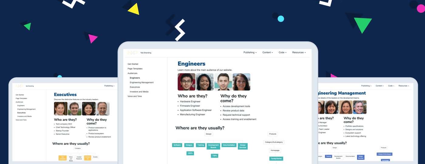
I proposed a site organization based on an audience scheme, with a narrow and deep hierarchy:
- Home. Summarizing all the pages content
- Brand. Showing the style guide content, plus some brand rules
- Content. The heart of this project to help publishers and page's creators: templates with documented building blocks
- Developers. Gathering our specific code guidelines and training
- Resources. Offering downloadable guides for third-parties, like agencies

Displaying those labels as a global navigation menu. Then we would introduce a left-bar for local navigation to scan content chucks faster.
Sketches and wireframes
How to explain the templates, communicate the storytelling sections and their interchangeable modules? That was the big UI and Interaction design challenge.
So I started with low fidelity wireframes to place all the content. Besides, I tried to set a user journey based on the ideal page's creation process:
Step 1: Where would my new page fit? - Getting started page explaining the corporate website's Information Architecture:
- Tree of all corporate website areas: products, support, etc.
- The company's goal for each area.
- Link to the respective page template.
Step 2: How would it look? - Template with and sections page:
- Page location according to the IA.
- Intended customer goal at this point.
- Audience (Type of customers visiting that kind of page).
- Page template’s interactive image.
Step 3: What info should I include on it? - Section details page
- Image displaying details.
- Section’s content goal.
- Constraints: Do’s and Dont’s.
- Content Guidelines
- Download and view code buttons

I asked users for early feedback about the content and journey. With more ideas I created the digital wireframes to be presented to the team for more feedback.
I used Invision Freehand so all could interact with the designs in the meeting, which helped us to add and remove ideas faster, such as:
- Instead of creating a template interactive image, we would use links aside to the template’s image. They help scanning the page better, increasing findability and reducing the development time.
- Eliminate the breadcrumb. Due to the development time and duplicity with the left navigation.

At the end, I followed a similar process with the rest of the website areas: Home, Brand, Developers, and Resources.
Development
Building with React
I used toI used to be developer before UX Design Lead. So I created a high-fidelity prototype, using HTML, CSS and some Javascript. Using that as base, the UI Developer and I decided to start the implementation.


Template guidelines page - Web Prototype
Looking at an early implementation, our manager asked us to explore options using React.JS. He had the vision to build this guidelines site on the same stack he wanted for the future corporate site. It would allow perfect compatibility and be able to perform local experiments without bureaucracy.
So, with some help of the IT department on the backend, the UI developer created the app environment. They selected Gatsby due to its short time-to-production. And I worked in some React components to use writing format Markdown as the content source.
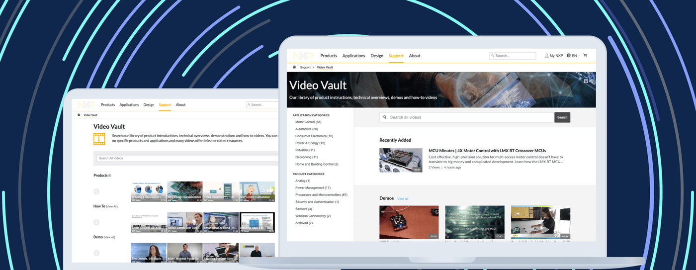
Some benefits of the new implementation:
- Faster page’s load speed (including images)
- A backend much easier to maintain
- Zero programming skills required to update the content, due to Markdown.
Once we had the first stable version I asked to release it so I could run tests with users.
Testing
Usability testing
Back then, my team was only consultants or producers of design work. I wanted to increase the awareness on how important UX design could be. So we had to talk about real tests and important metrics.
Based on the book “Don’t make me think”, I created forms for the facilitator and the observers to introduce a easy process to run moderated usability test sessions.
At the beginning my manager thought it was enough just to ask around for some opinions. But that changed after sharing the first recording of an usability test. All the team saw how design was not as clear as we thought.
It was fun! They helped me running 2 series of 4 sessions with some of the users: marketers, engineers, and publishers.

It was super useful to discover users’ preferences. Here are some examples of our iterations:
- All the users used the left-bar navigation instead of the header menu. We reduce functionalities on the menu and improve the left-bar with micro-interactions
- People were confused about the “View code” button. They expected to see code and real-time changes on the screen. It was out of the scope, so we changed the label to “Go to code”. But we added the desired featured to the backlog
- It was 200% more engaging using call-to-action links instead of clickable elements
- People who were not engineers needed product pages from the corporate website as examples. We added some so people could see the real use of any template.
- Users were new to the modular concept. So we broke the template’s page into tabs to represent its sections. It help them focusing on 1 topic at a time while building a page.
Results
We used 7 months to create this tool. After 4 iterations, from the research new scope, the development with react, and two testing rounds. We helped the publishing, marketing, and engineering people to keep design and content consistent.


This guidelines website with our new design system made updates and pages creation easier. After two months we saw these results:
- Internal tasks were reduced by 80% in the next month after release
- Page creation timePage creation time was reduced to only 2 hours (4 meetings) instead of weeks
Product Marketer: Now it’s clear to me why we should consider design in our requests. It improves customer engagement with consistency.

Benefits for the team were:
- Learned 3 new tools. My UX/UI team learned atomic design, usability testing, and markdown
- Increased collaboration. We built a space to communicate better with engineers, marketers and publishers from Mexico, USA, and Europe.
Publishing Team: We have now the power of knowledge on a new page creation. This guidelines helps to maintain all pretty and easy to build.
Lessons from leading this project
Getting to the right problem to solve was challenging. But in the end, results come from building and testing: failing fast and cheap.
Moreover, feedback is incredibly useful! Critique sessions with my team and maintaining clear communication with management regarding the expectations and progress was perhaps the biggest teaching after leading this project.