Summary: I redesigned the UI and search experience at our corporate video platform. It reduced findability issues and increased users’ video consumption.
Creative strategy brief
I had some interviews with the Technical Support Department about the main issues and users’ profiles. Then a stakeholders review, so we could agree on the following points:
Why this project

This semiconductors company produces lots of training and promotional videos for trendy products. Storage, classification and reproduction were supported by a legacy platform called “Video Vault”.

It daily served hundreds of engineers, who struggled to find technical reviews and demos about our products used into their projects. So redesigning this platform meant an increase on users and bring customers into our funnel.

Audience
Electronics engineers. They need quick answers about design constraints and features enablement. So they watch product tests videos to jump to specific cases and explanations as well as following tutorials or highlights on certain products as part of benchmarking.
When using the platform, they normally are at:
- The laboratory, in a test bench with the equipment connected, at the middle of an issue to solve.
- At a desk, working on a Bill of materials or supply catalogs.
Business goals
- Redesign the findability so customers could get to the correct video, increasing the time on page.
- Give accurate suggestions, reflected on a higher click rate in the suggestions section.
- Reduce the bounce rate during a video search.
Team & responsibilities
React Developer: He was in charge of the front-end: UI, interaction and functionality development.
IT Department: They contributed with all the setup for the new web application into our corporate website.
Video Expert (SME): He was my primary contact to the video technology -Brightcove- implemented into our servers.
Me, as UX/UI Designer: I designed the new UI and defined the interaction for all the new platform. Besides, I provided some markup and styles for the new components.
Our Digital Experience Manager: At Austin, but traveling often to Guadalajara. He managed UX/UI, web development and content publishing teams. So he was the final approver of the project.
Constraints
- Re-build the platform using our new development stack based on React.
- Changes in our video technology framework were out of discussion.
- We should offer something visually similar to the “YouTube experience”.
- Features related to personalization were out of the scope.
- 4 sprints—2 months—to release. Besides, the team was working on 2 or more projects at the same time.
Benchmark
Analyzing video experiences

During the first sprint, I analyzed several video platforms. I looked for trendy features, popular interactions, and expected journeys. These are some of the insights:
- Personalized suggestions were key on engagement and consumption. We had to produce a similar effect without involving profile information because of legal constraints by the time.
- UI focused on content preview. Technology limited us to offer “hover auto-play”. But there are other ways to communicate to users about the video’s content.
- Short search journey. Based on two steps: Type some keywords, pick a category or channel. We had to exploit our video labels’ implementation. They were hidden in navigation and UI.
- Popular content highlighted based on time. Stakeholders had had problems with Marketing requests to highlight videos. Now we had the opportunity to define rules for hand-picked spaces, time sensitive and popularity.
- Advertising spaces. Suggested by stakeholders, sometimes we had to highlight business partners’ content. We needed something not intrusive but complementary to the video content. We all hate ads.
UI Design
Wireframes
I drew several options to arrange the information into spaces. Besides, they helped to illustrate the user journey.
Step 1: Homepage
- Global header and footer, plus the Hero App Banner, were mandatory.
- Left bar for categories navigation. Using the known product classification.
- Using a search bar with basic error handling.
- Clear content hierachy for hand-picked content to allow stakeholders to curate a premium space.
- List of most seen videos (algorithm) in curated categories, with a label to display more items

Step 2: Search results
- Active filters section, above categories to display the modifiers of the list of results.
- Results list with pagination and sorting options for time and popularity.
- Result items as a thumbnail with name, description and metadata.

Step 3: Video player page
- Video player with description and metadata.
- Recommendations optional space at the right column.
- Bottom section for promotion of partners’ content.

High-fidelity Mockups
After some design feedback, I prepared several options in mid-fidelity mockups to discuss with stakeholders the best solution.

Simplicity wins over abundance of choice. Explicitly state the difference between options. — Nielsen Norman Group
Design Tradeoffs
Primary action over variety of options
Stakeholders wanted spaces to fill according to their different agendas. But we couldn’t design something to allow dozen of minimal updates, we needed the algorithm. So I advocated for having 3 categories which could be updated with analytics data to reflect popularity and time sensitive content.
We're not YouTube
Our users don’t come to watch trends or latest product’s news to this hidden platform. They come with a problem to solve. Besides, they might not be familiar with our product’s classification. So I added a section with lists of applications per industry segments so people could find content related to their job.
Fewer clicks doesn't mean intuitive design
I added the “View all” label to show more items on demand. Once clicked, it was a category filter applied into the search page. Then, people could refine their search in the list view, instead of scanning dozens of thumbnails at the homepage.
Final Design
Step 1: Homepage
I prioritized a clear search journey over fancy interactions. And persuaded stakeholders to keep minimal options even they saw every white space as a wasted opportunity to conversions.

- I added the first section for recent content to prove stakeholders this was not a valuable parameter or filter for the users.
- I kept Demo and How to’s sections to place the most popular videos. Besides, the “View all” label directed to those filtered results.
- I introduced a section to browse by application category. It allowed stakeholders to curate the most important filters per business line.
Step 2: Search results
I used a list of items instead of cards to scan faster the content and show a decent portion of the description.

- Using the faceted navigation as category filters was very useful to go deeper into the area of interest: product families to compare specs or application type to explore solutions.
Step 3: Video player page
Technology limited the player's features. So we offered better selected suggestions, according to the previously selected filters and products related to the video. So they gave the sensation of personalized content.

- The bottom section was optional to offer some partners’ products to complement the solutions on the video.
UI Code Documentation
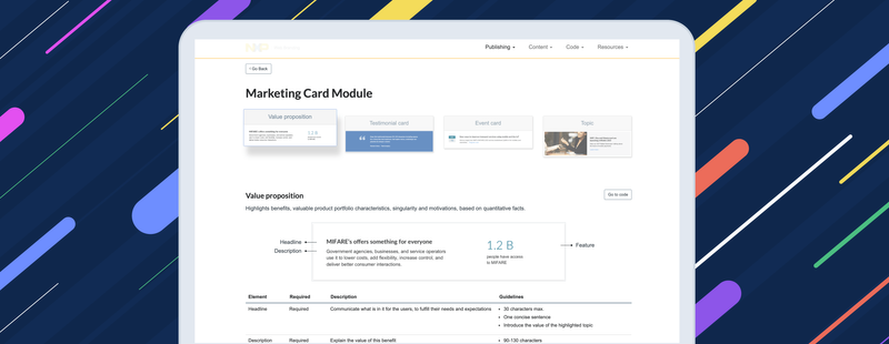
By the time I was also working on building our design system. So I created a demo page as placeholder to document the code.

This short demo could be still available at: Video Center Code. But the new design system website later replaced it.
Results
Before redesign
According to our analytics team’s report, these were our numbers on July 1 month before release:
- ~83%. Homepage and results bounce -abandon- rate (no video played).
- 4:12 min. The average time between arriving the page and playing a video.
- < 8%. Average click rate on recommendations.
- Search bar. It was the most often used interaction.

People were spending almost 5 minutes to find a video useful to their needs. Moreover, they often left the platform before playing a video. And they rarely clicked on the random recommendations next to the video player.
After redesign
Later by December, 3 months after the release:
- ~53% (-30%). Homepage bounce—abandon—rate.
- 1:33 min (-2:39). The average time between arriving the page and playing a video.
- ~23% (+15%). Average click rate on Recommendations.
- Category filters. They were the most often used interaction.

People found a useful video to their needs after a minute, so they stayed more at the platform. Besides, they got something useful from the category filtered recommendations around the video player.
Lessons from this project
Standardizing labels and metadata
It was weird for developers to display the timestamp in the format I proposed. When to show time in hours or days? Why? It was shorter and easier to read "2 months ago" than "05/05/2019 4:53 P.M.". Guidelines could've been writen.
Very detailed content into mockups wasn't necessary
I would’ve used that time to create a better guide on how to use the UI instead of looking for examples and placing the real data into hi-fid mockups.
Start with a creative strategy saves meeting time
Clarity on the audience and goals helped me during design tradeoffs. I just had to remind stakeholders to read our Brief to make them focus. It helps to deliver each stage on time.
This project was finished by August 2019. The current site is live at: Videos—Solve problems and stay informed with quick how-to and demo videos.